In 2020 I was contacted to Further as a sports branding design consultant / design lead to help the studio navigate branding a new professional basketball team, The New Taipei Kings.
This Case Study follows the brand from its inception in 2021 through to real world applications of assets and implementation of the style guide over the course of the last several years.
More details about the strategy and apporach to this project can be found after the image galleries. Case study copy courtesy of Further.
New Taipei Kings
– Brand Identity
– Graphic Design
– Typography
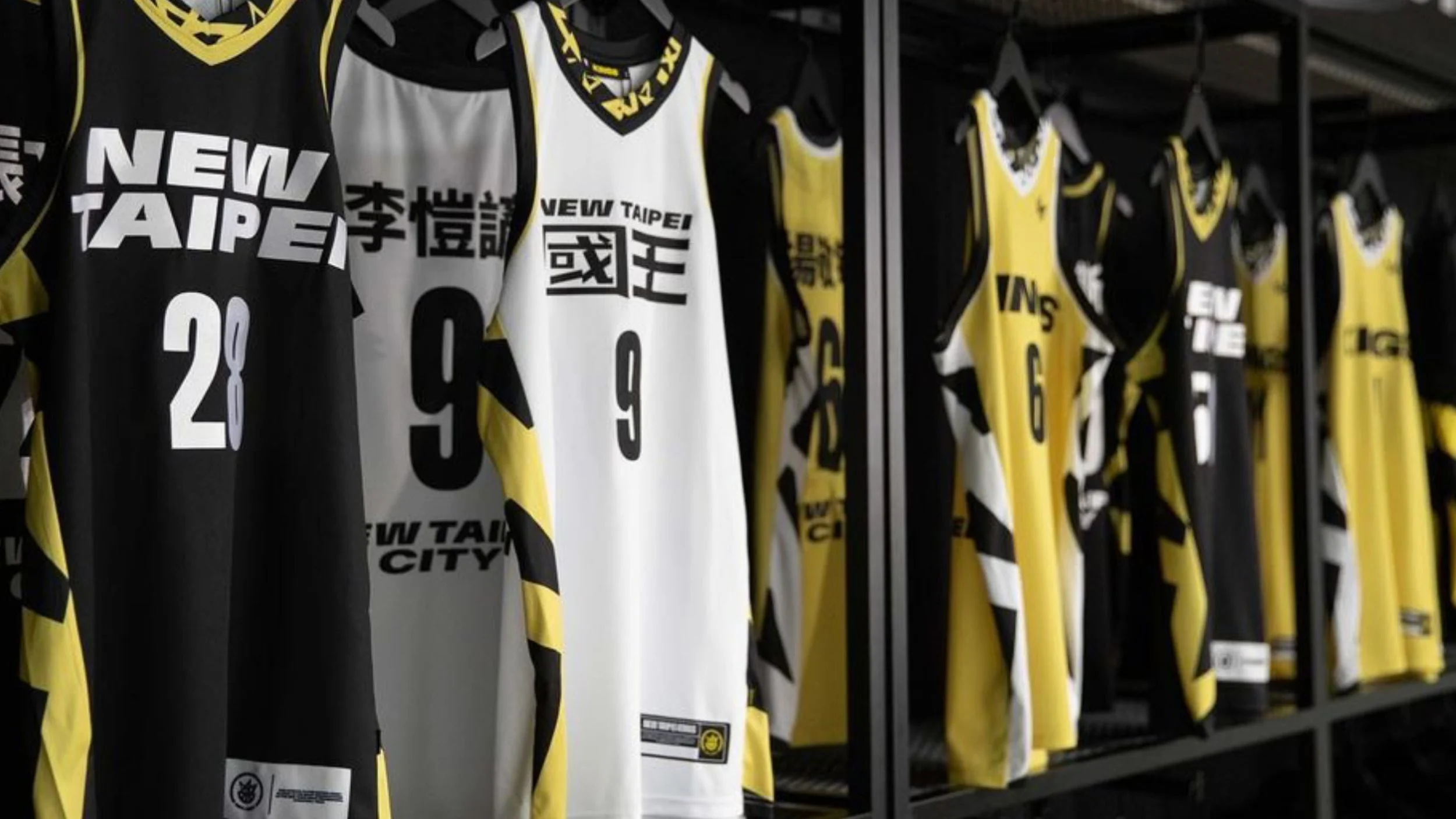
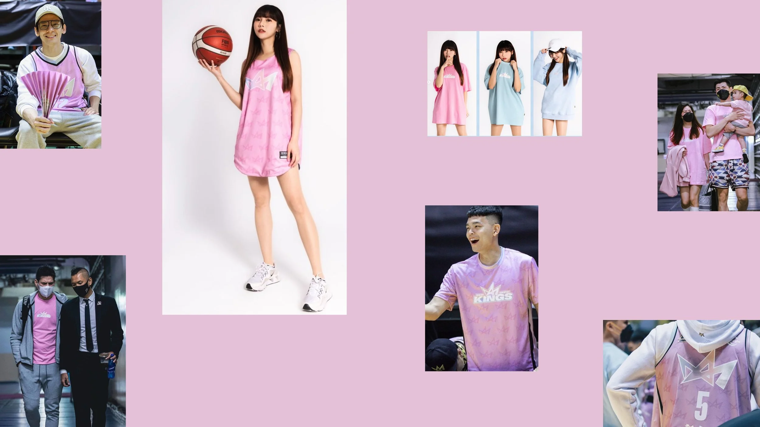
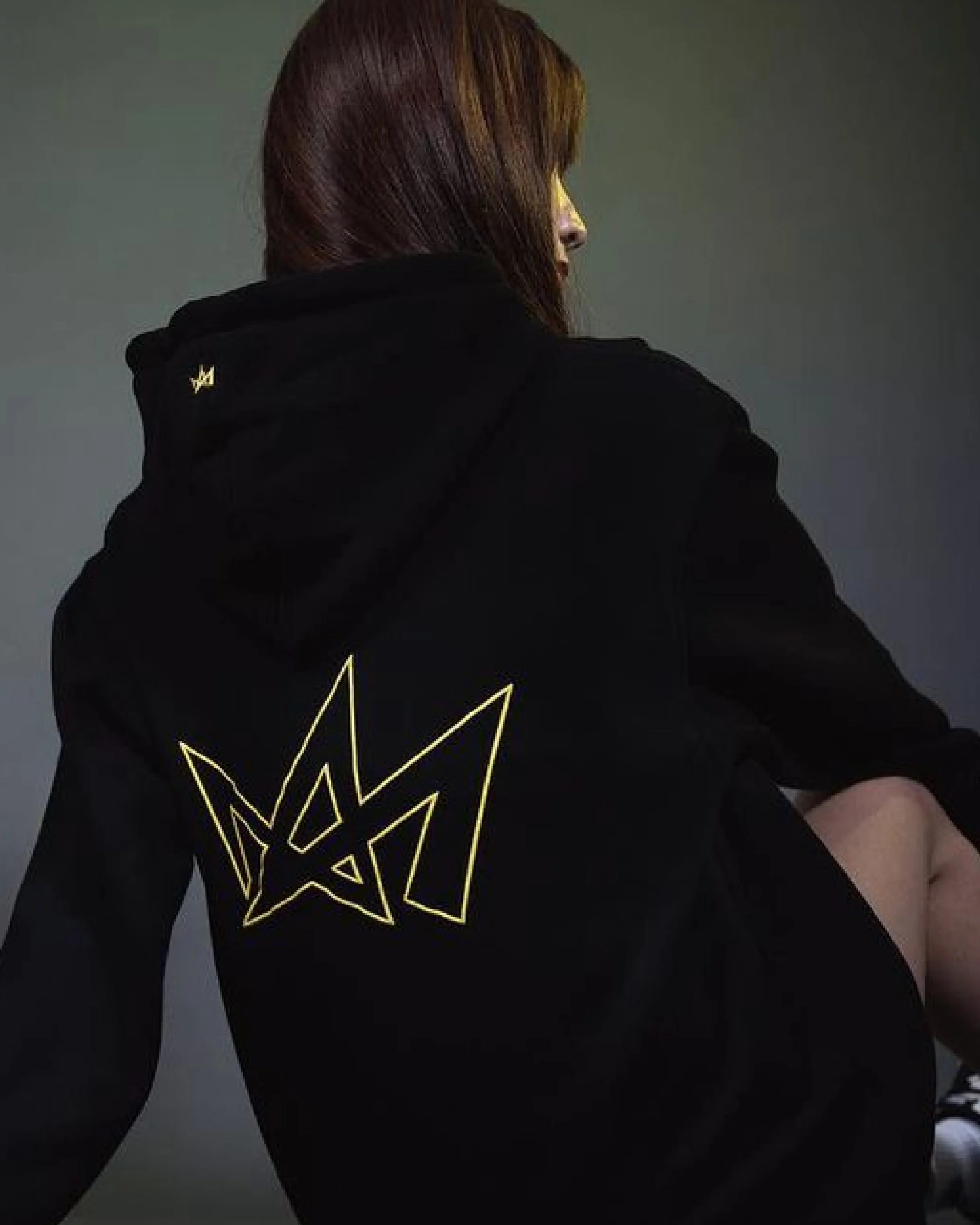
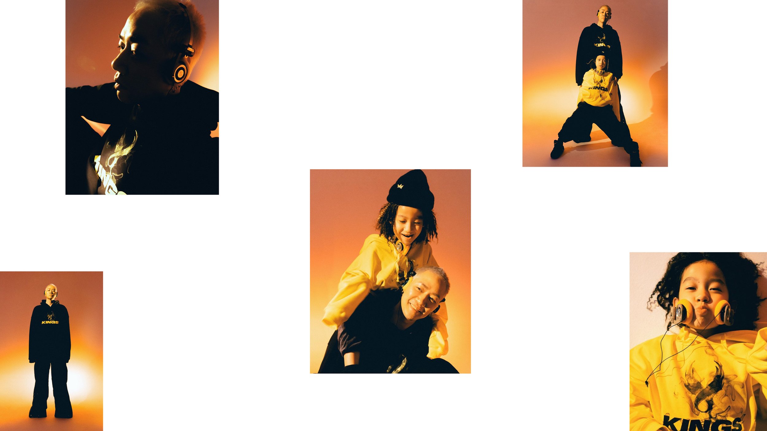
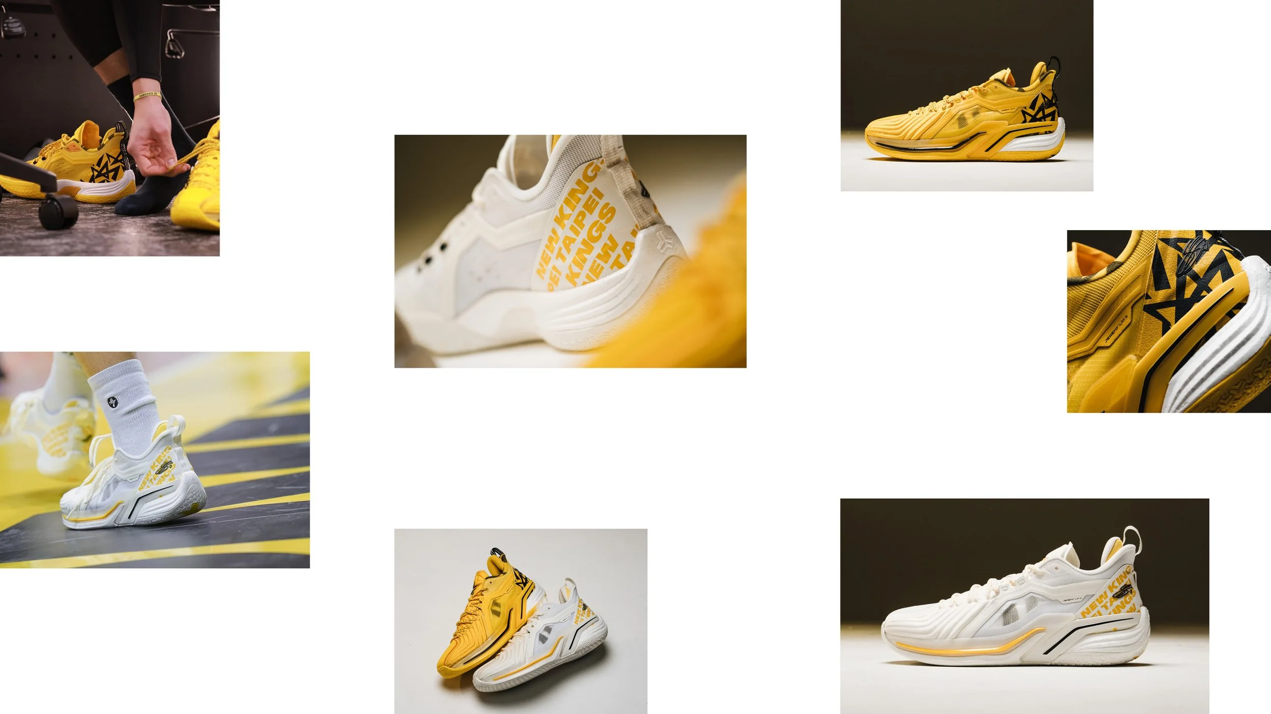
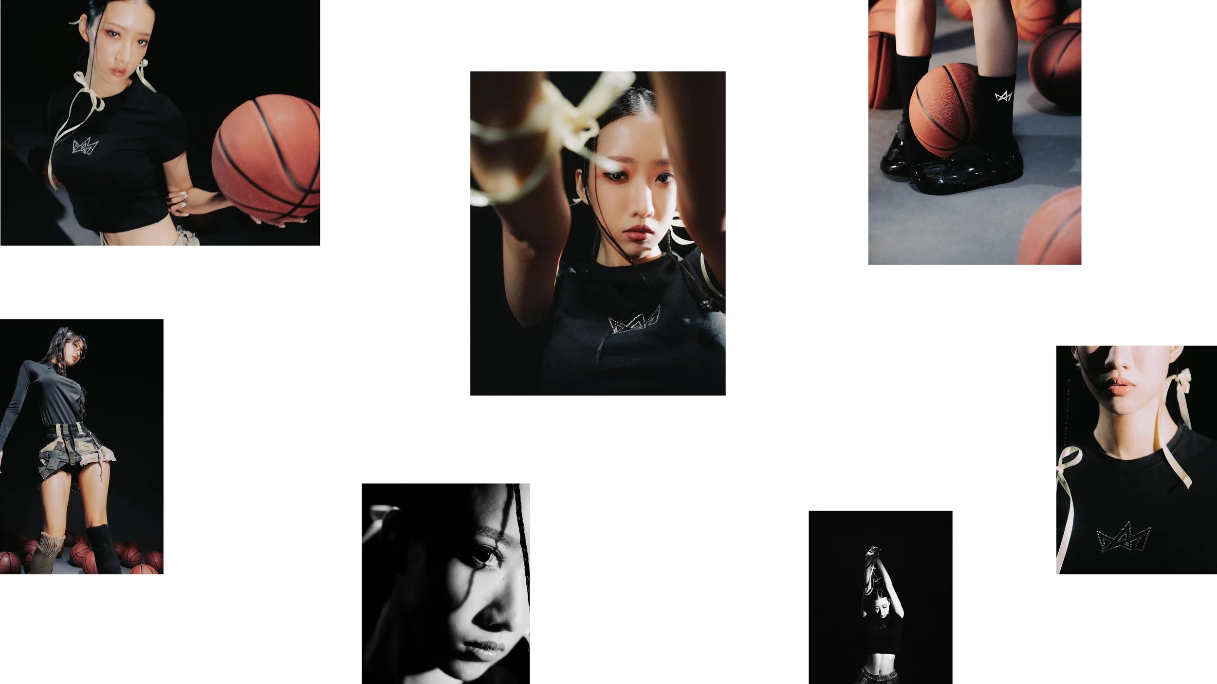
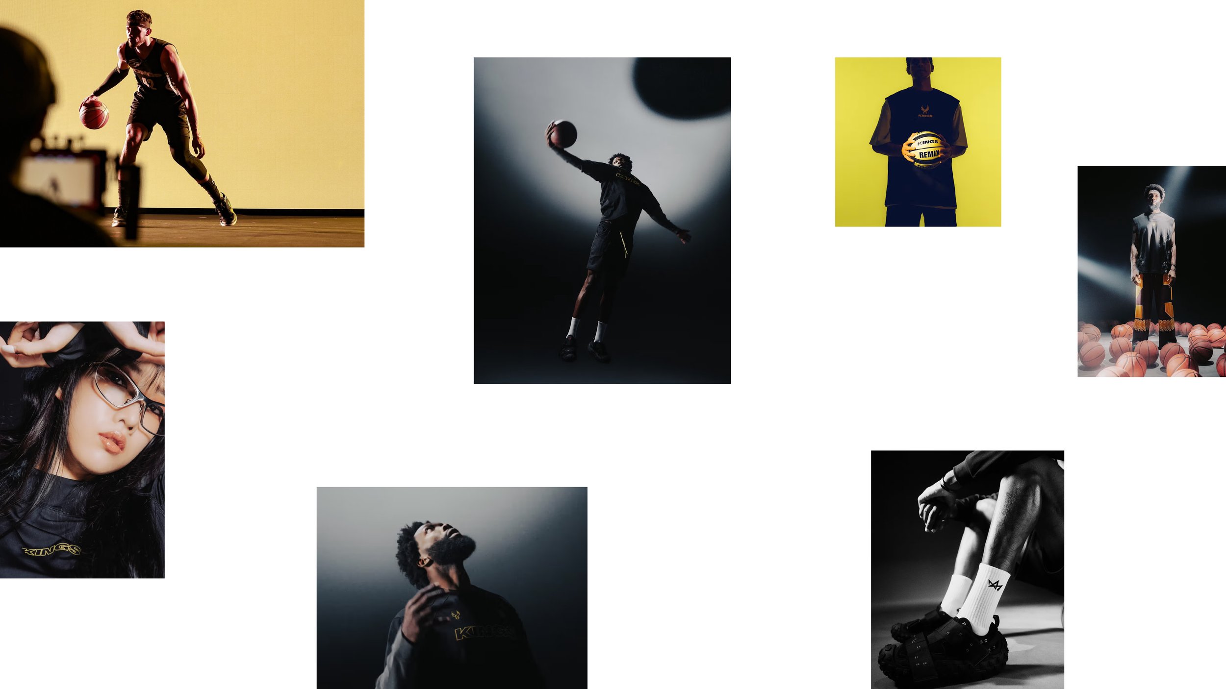
– Apparel
– Uniform design
– Campaign
– Brand Guideline
Role:
Freelance Design Lead
Sports Branding Specialist
Agency:
Further
Full team credits
after the images


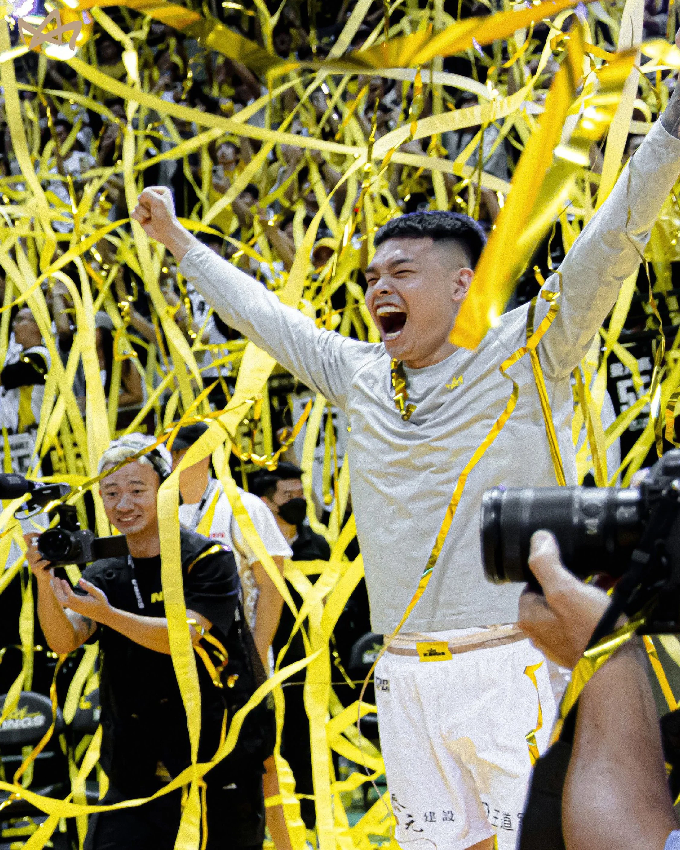
Creating a new sport sensation
After a 20 year hiatus, professional basketball had returned to Taiwan. Following a successful inaugural season, Taiwan's pro basketball league – P.League+ – expanded by welcoming two new teams to the fold.
The team behind the newest franchise to the league – New Taipei Kings – needed a new brand strategy and visual identity to bring the team and its mission to life.
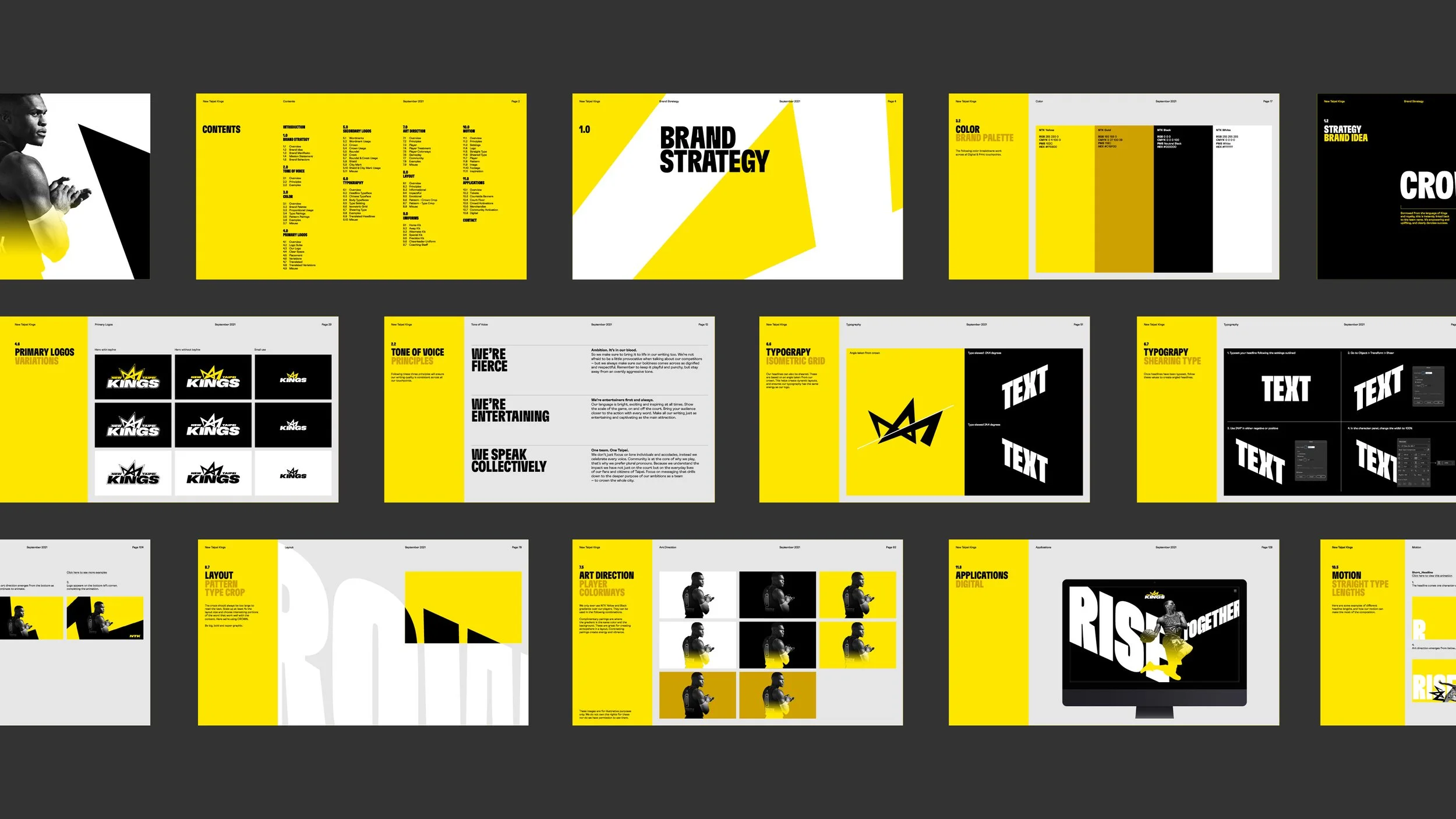
Brand Strategy
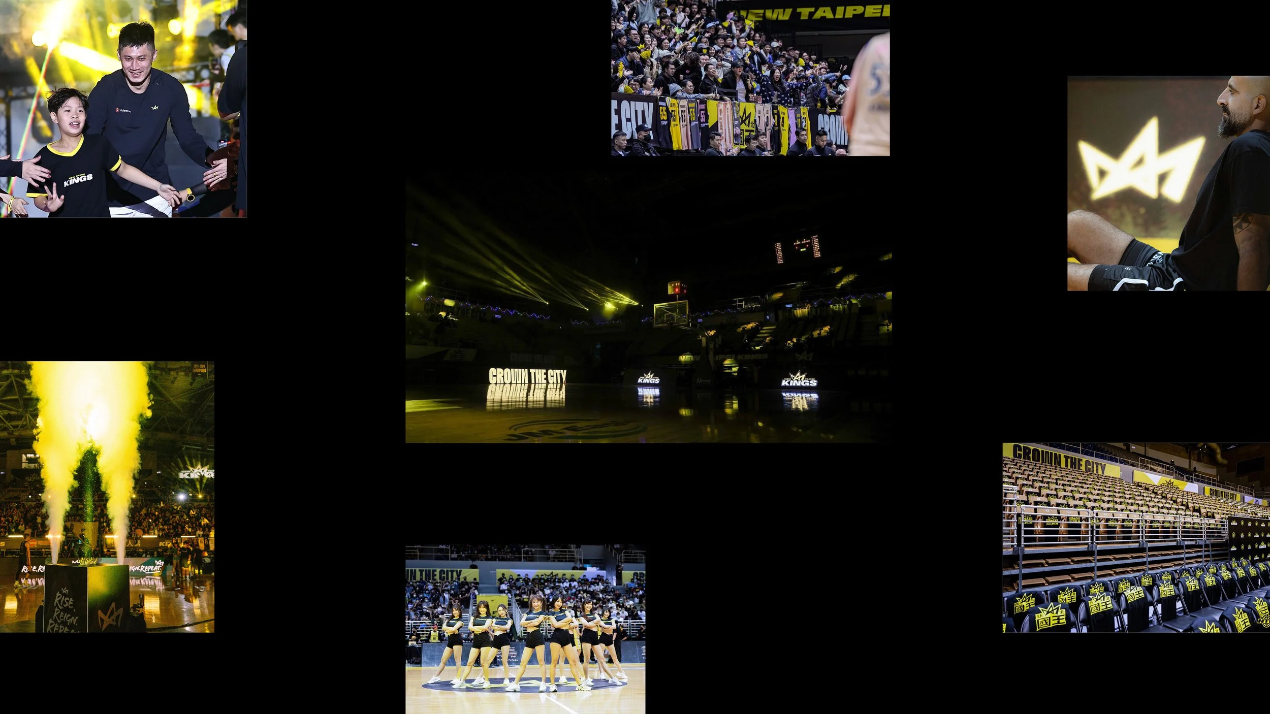
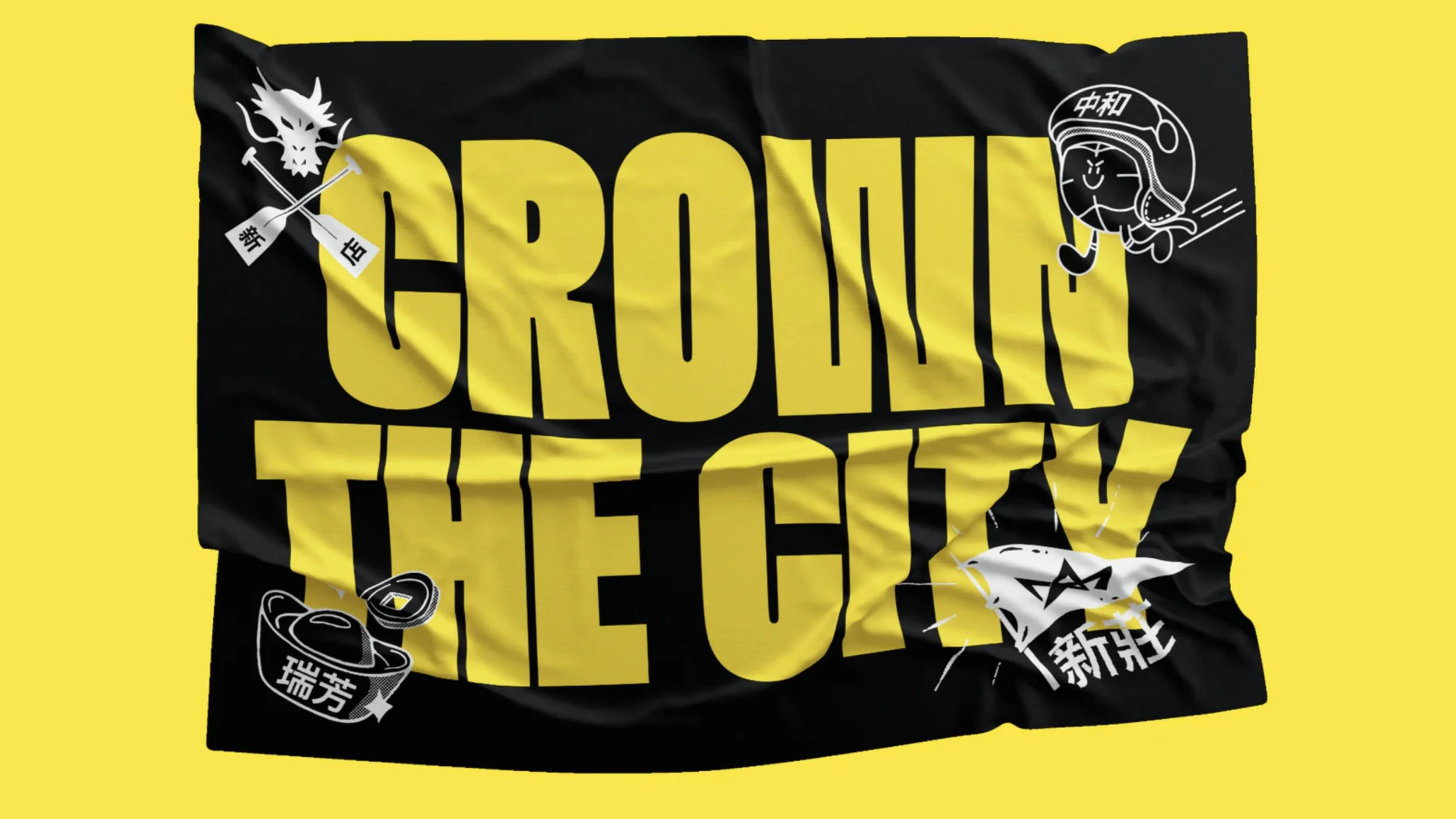
The core of the strategy is built around a rallying cry, a chant and an anthem, ‘Crown The City.' A clarion call to arms for the team, the fans and community reaffirming their determination to uplift and empower New Taipei City, on and off the court.
A comprehensive strategic and messaging toolkit helps the Kings raise their voice, from mission statements and strategic principles to a team story, manifesto and tone of voice guidance. Ensuring their passion, purpose and voice can never be confused for another.
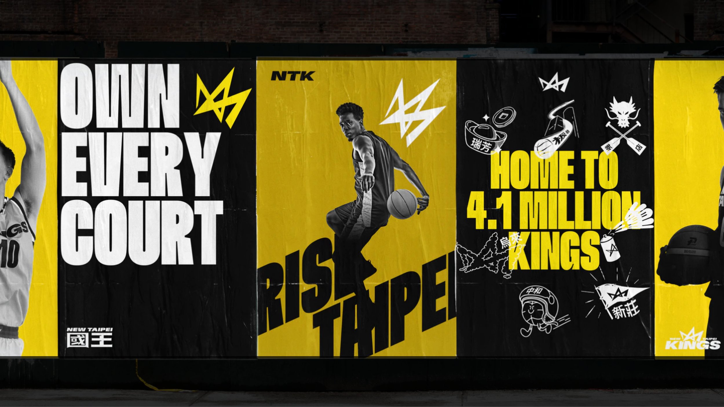
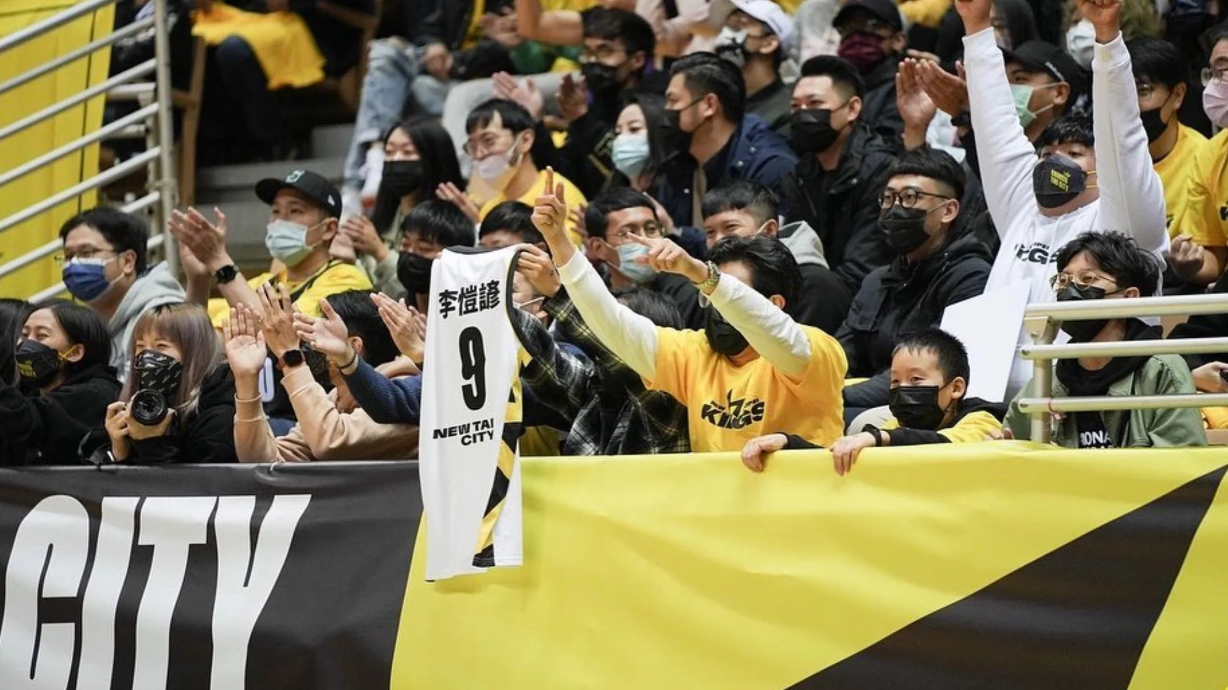
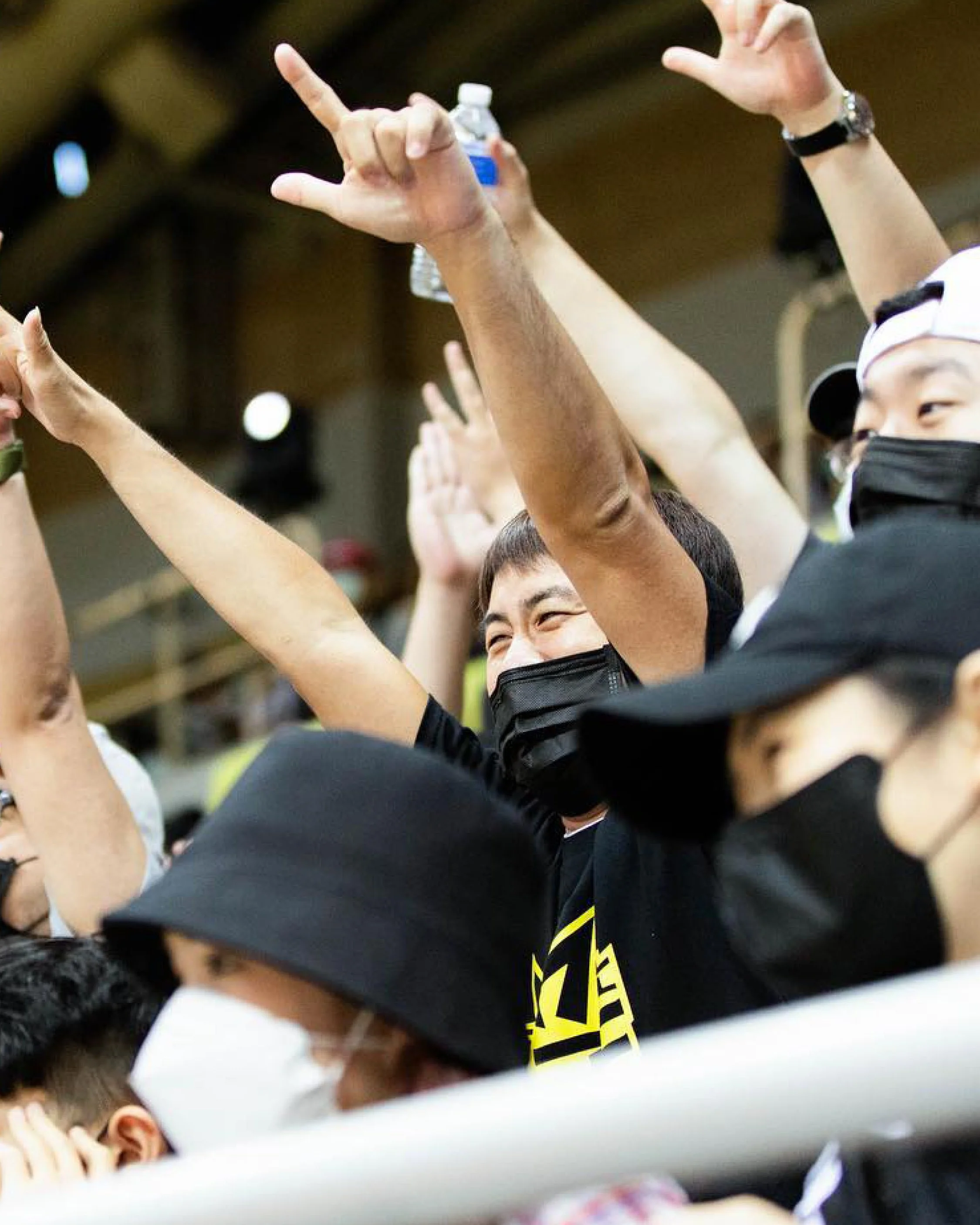
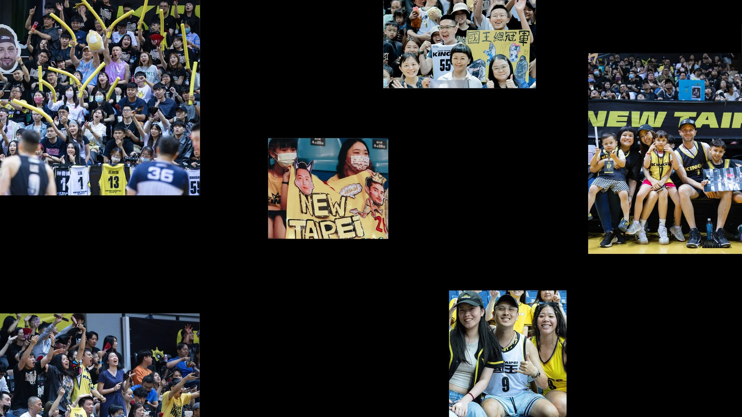
Community Connection
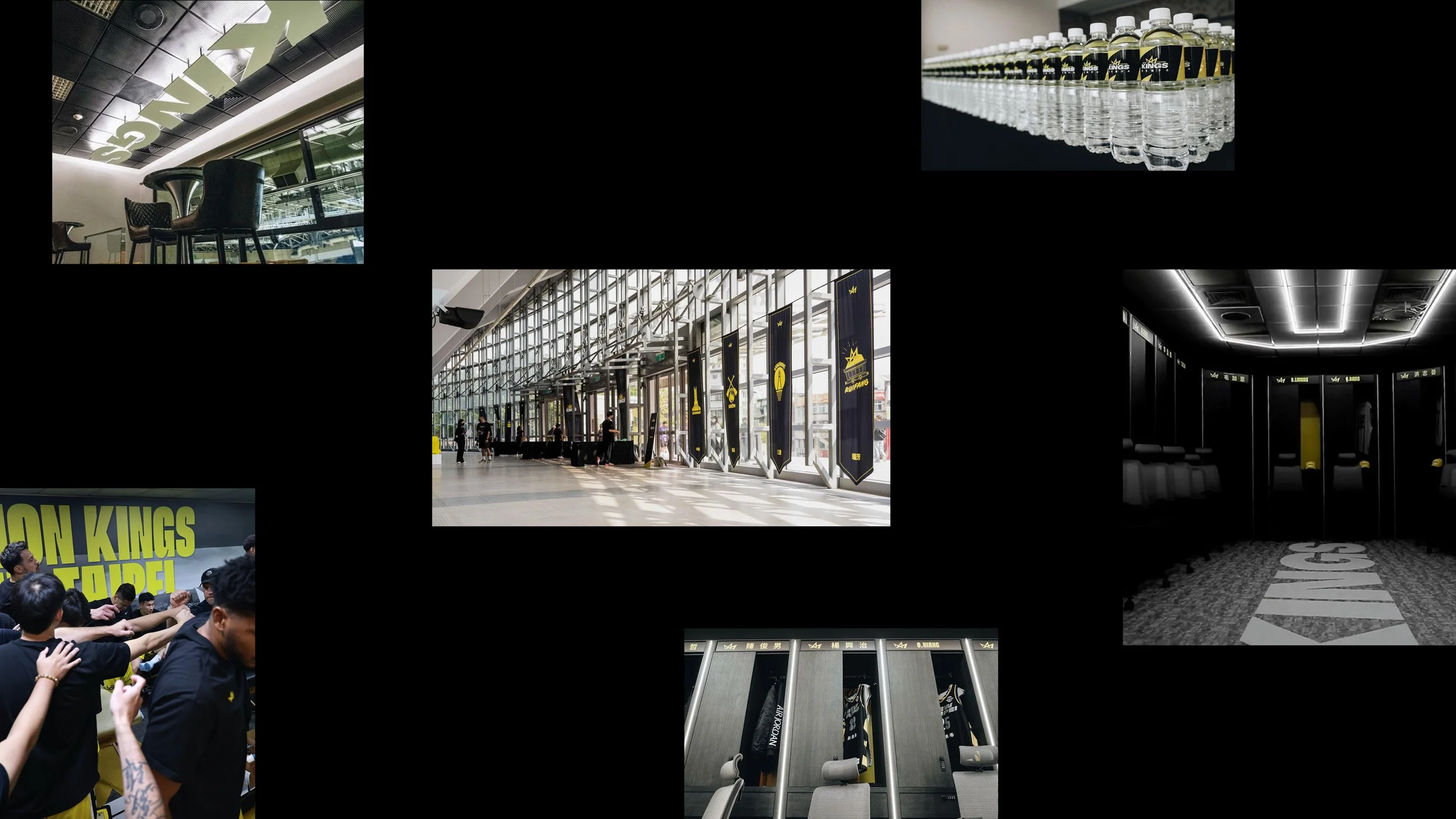
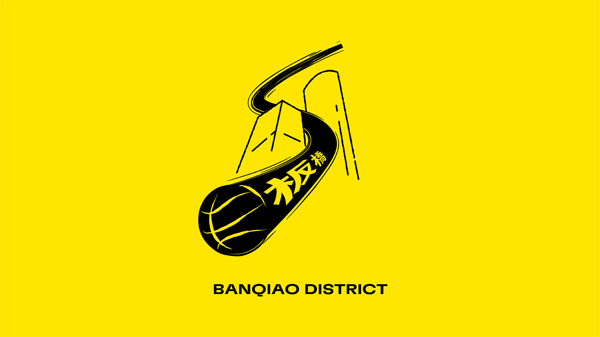
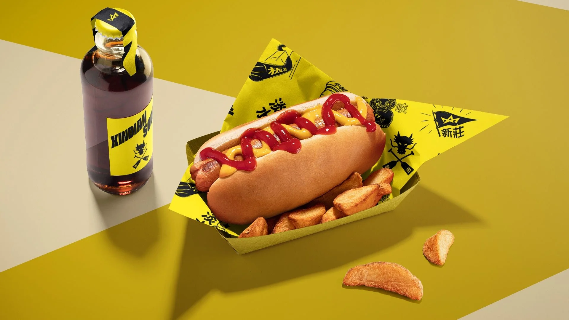
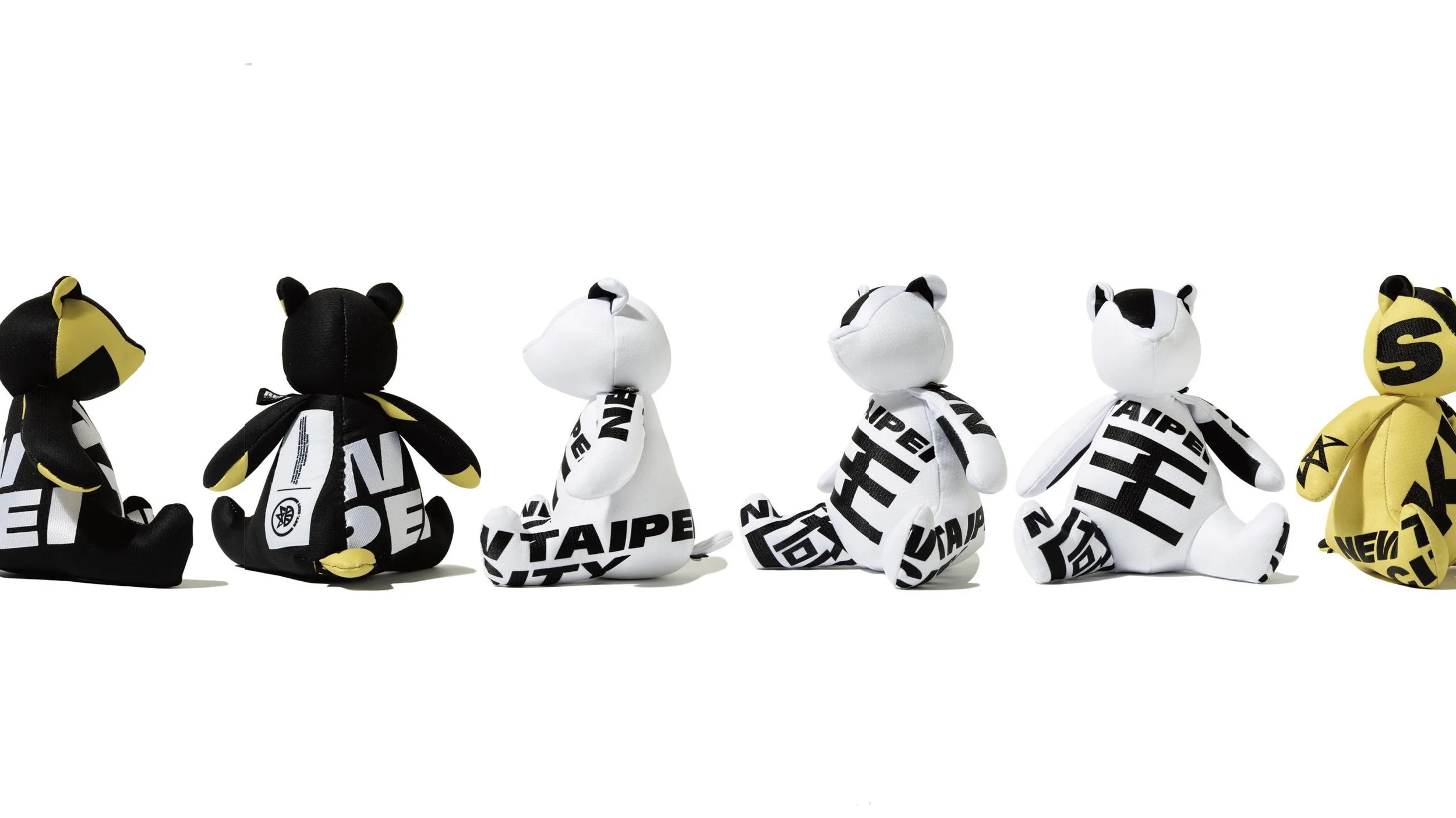
Key to our brand was weaving the 4.1 million potential fans and their communities into the story of the Kings. We created distinct logos for each of New Taipei City’s 29 districts, drawing upon local characteristics, architecture and even cuisine to give them a purposeful connection to each place. These become part of the fan and game day experience, from flags on centre court, merchandise and even food and beverage packaging.
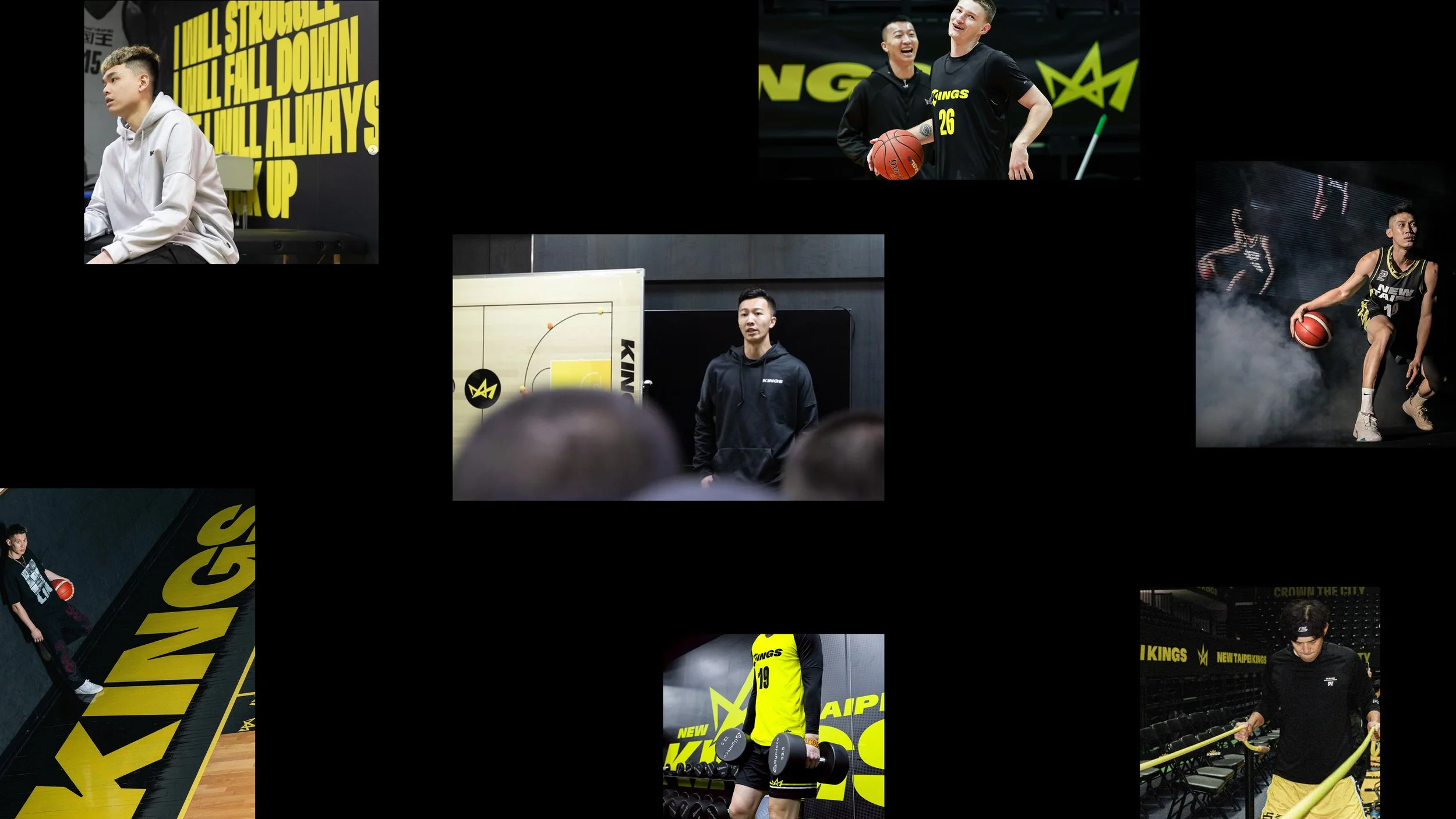
Immersion
The New Taipei Kings are out to disrupt what it means to be a contemporary sports team in Taiwan. From advanced sports science and mental health programs that support their athletes, to the way they engage local communities and inspire and uplift the next generation through their academy.
Further worked closely with the key stakeholders behind the team including CEO, Phil Chen; the Taiwanese government and the P.League+ founder and CEO, Charles Chen. Together, we developed a rigorous strategic toolkit to guide the team on their mission and inspire the brand.
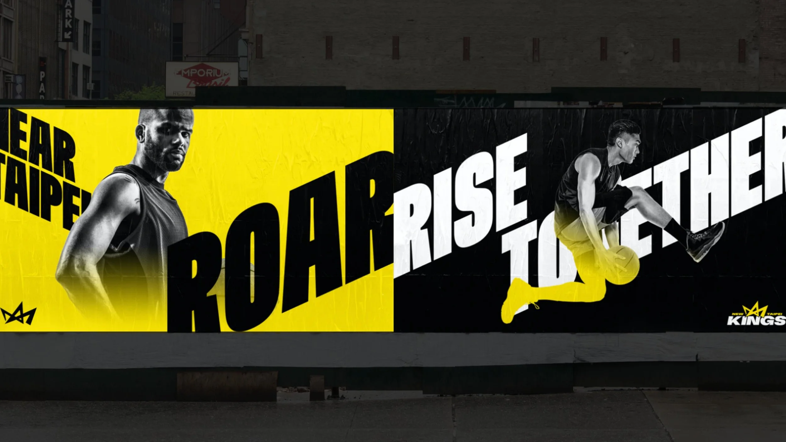
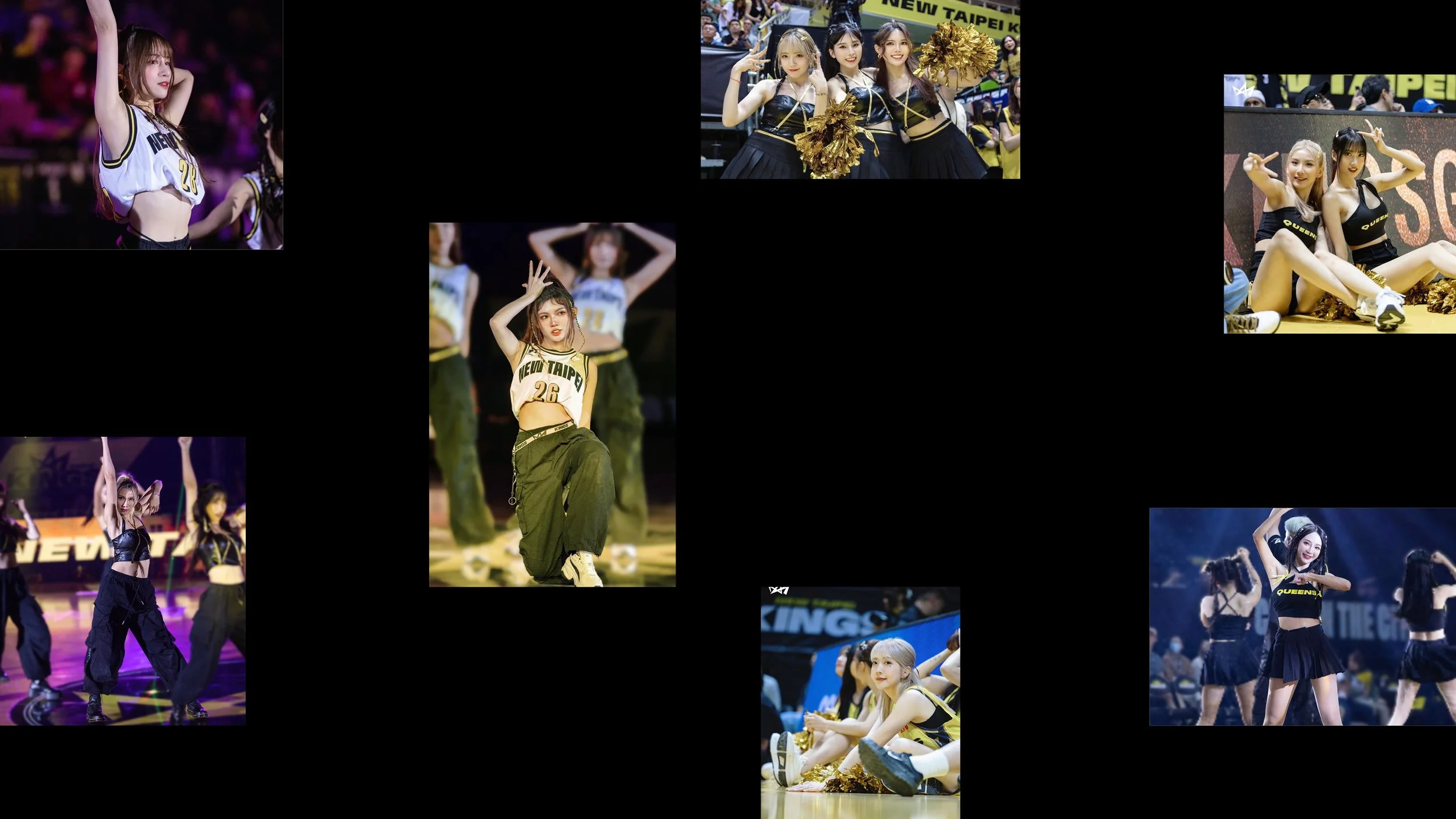
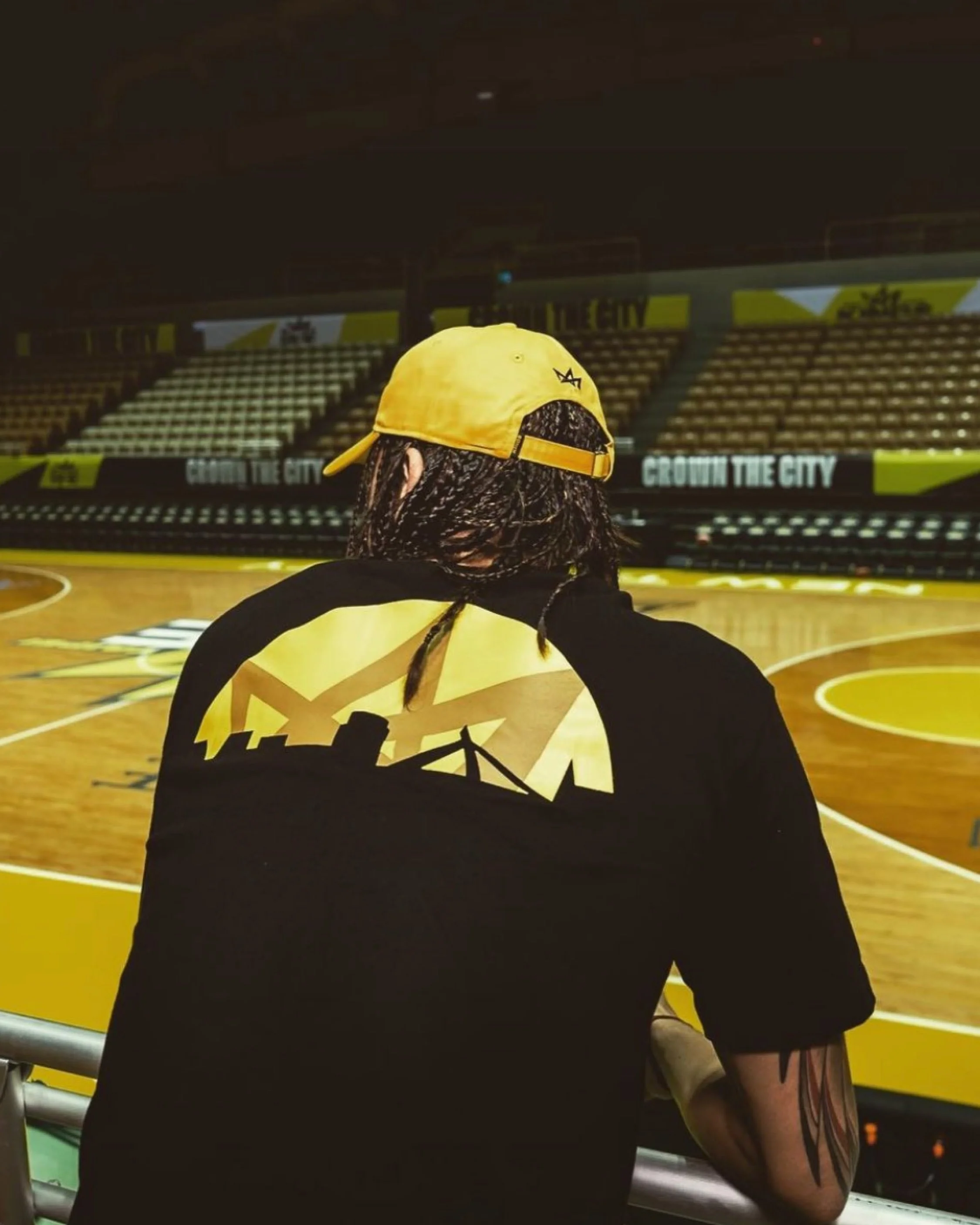
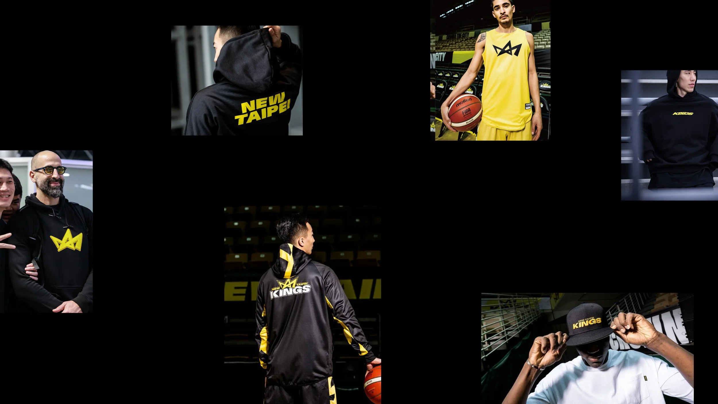
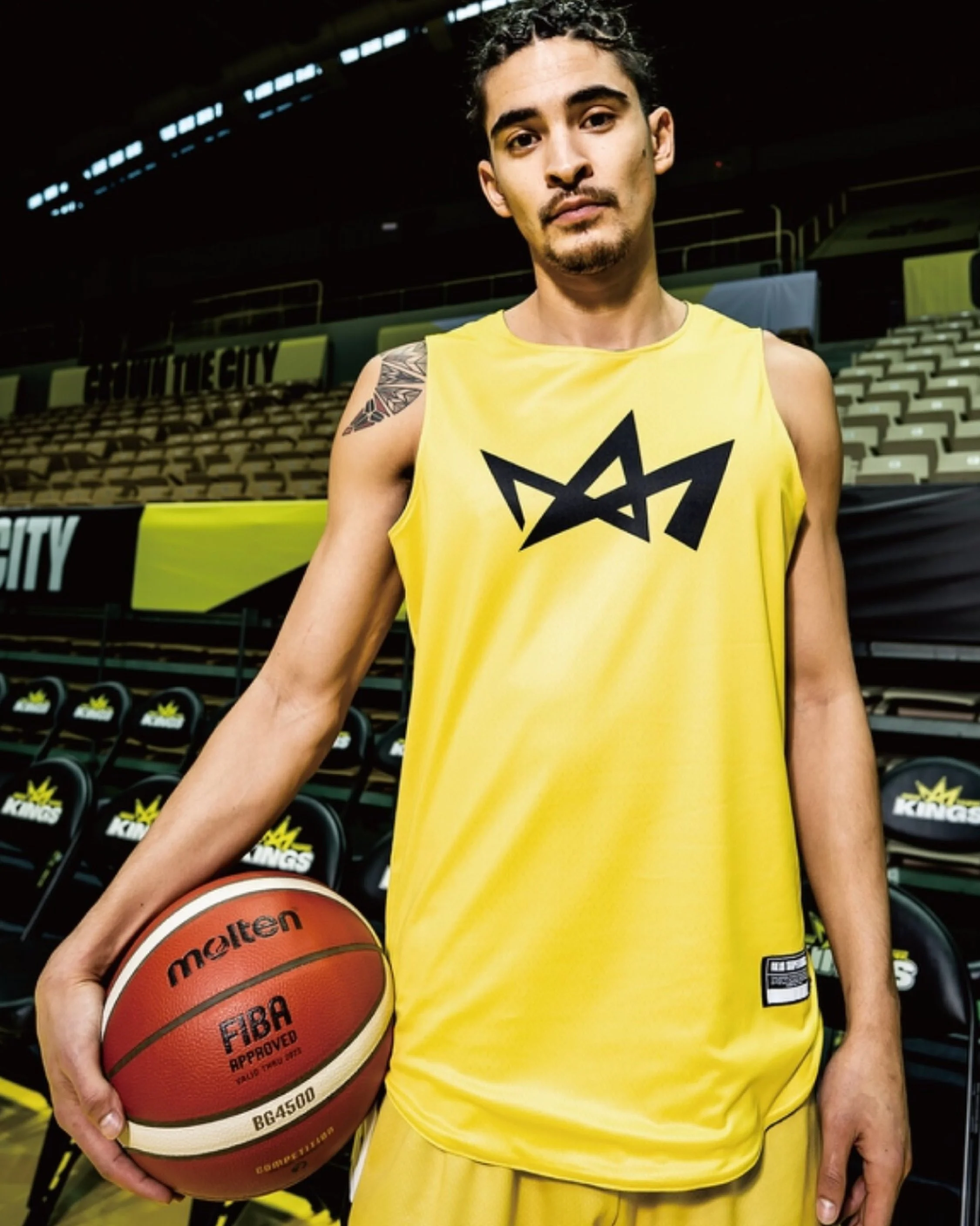
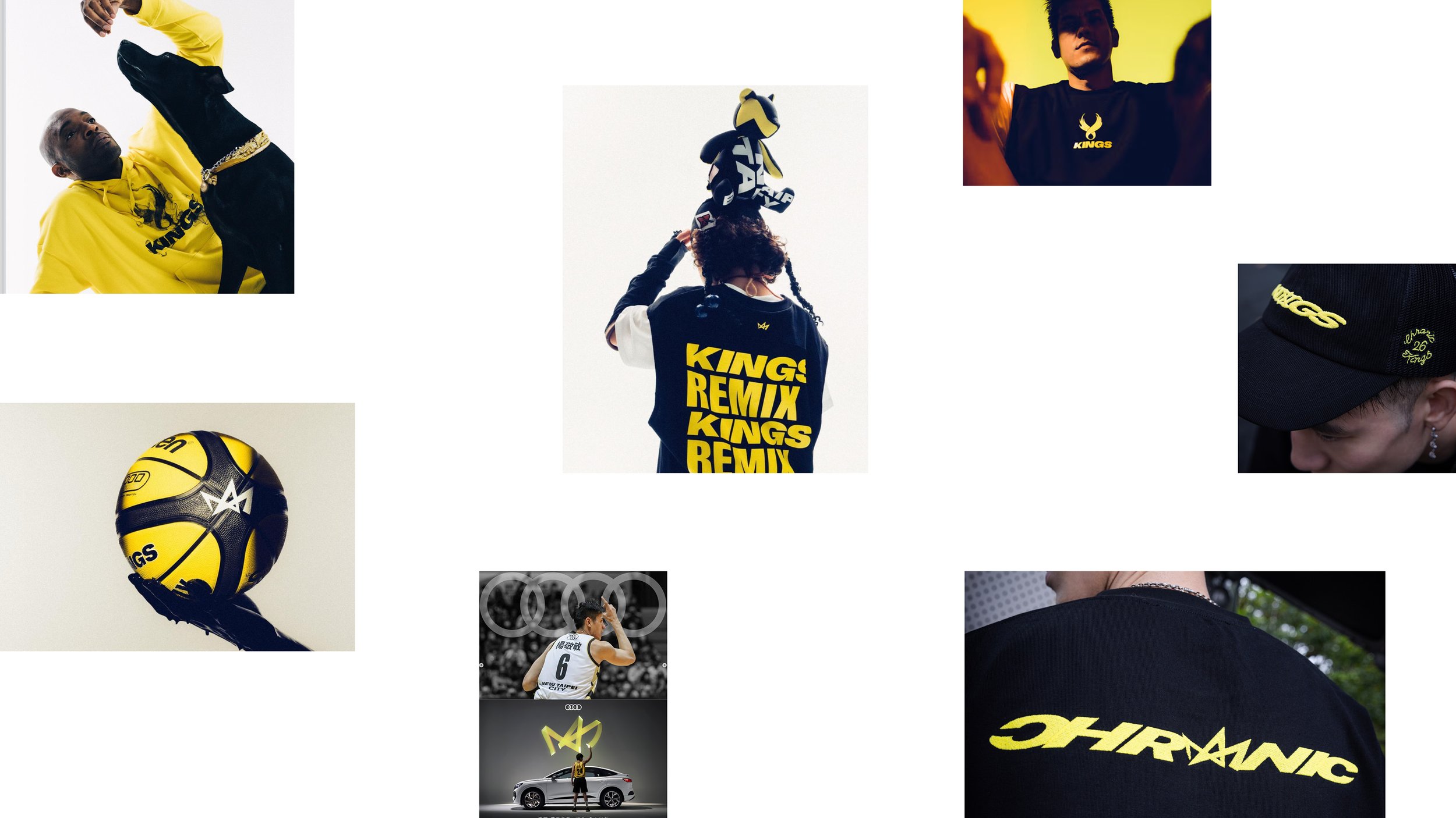
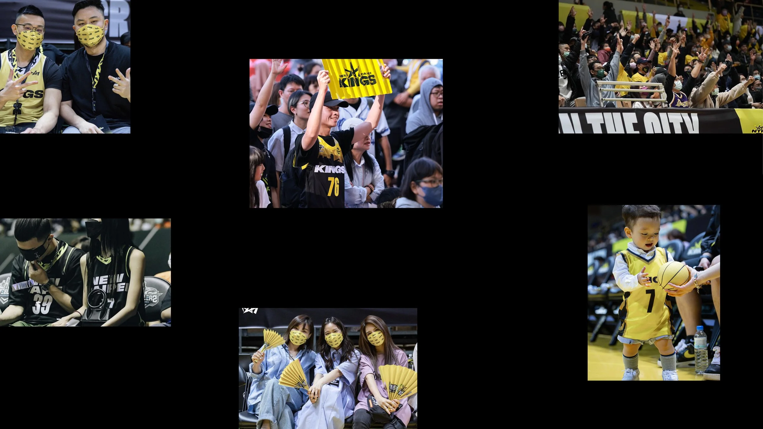
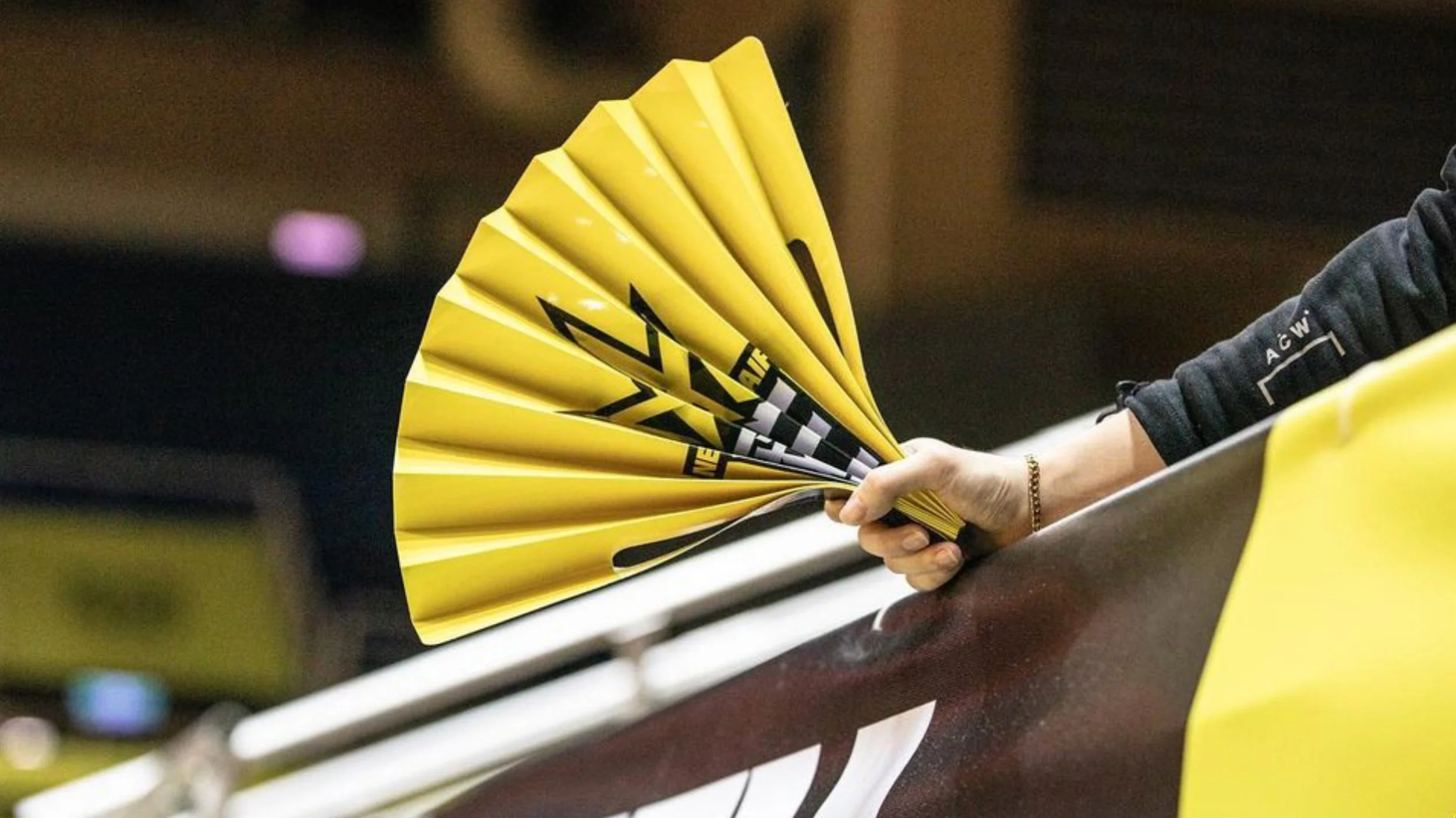
Brand Expression
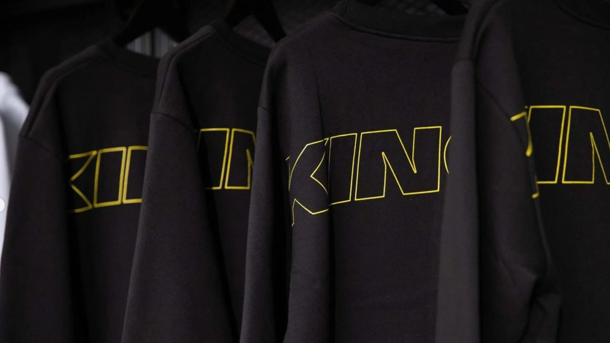
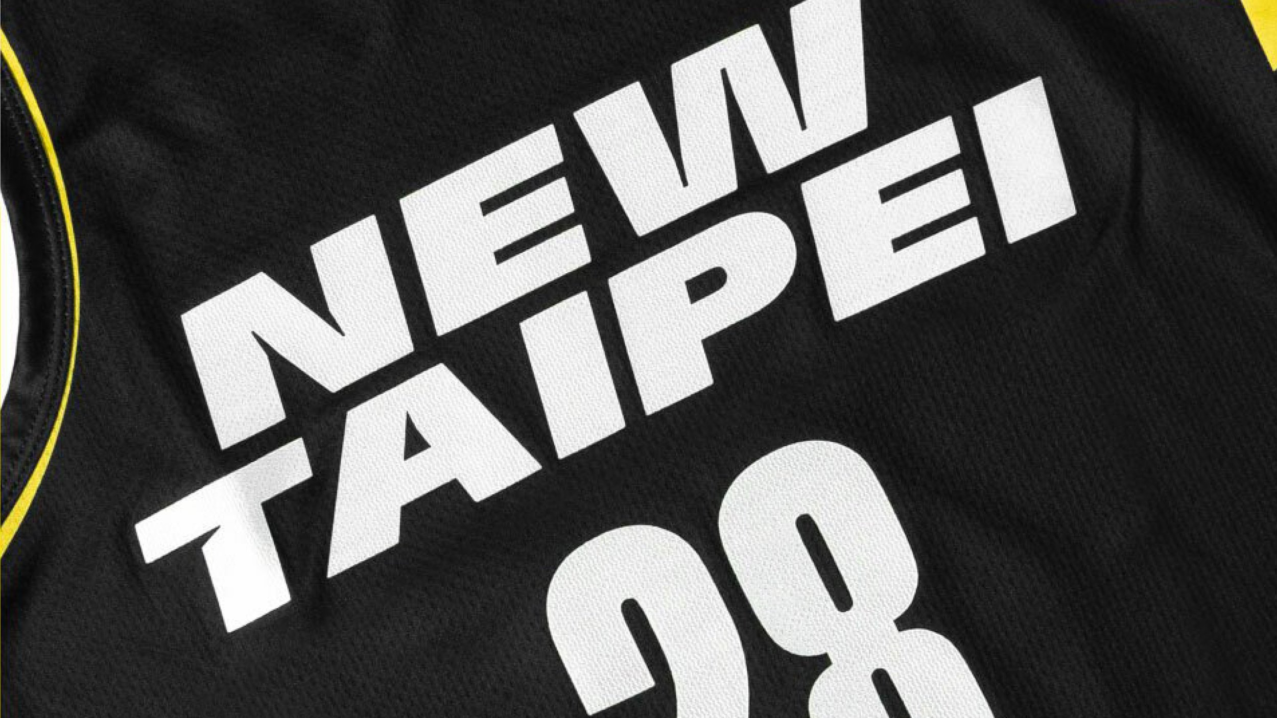
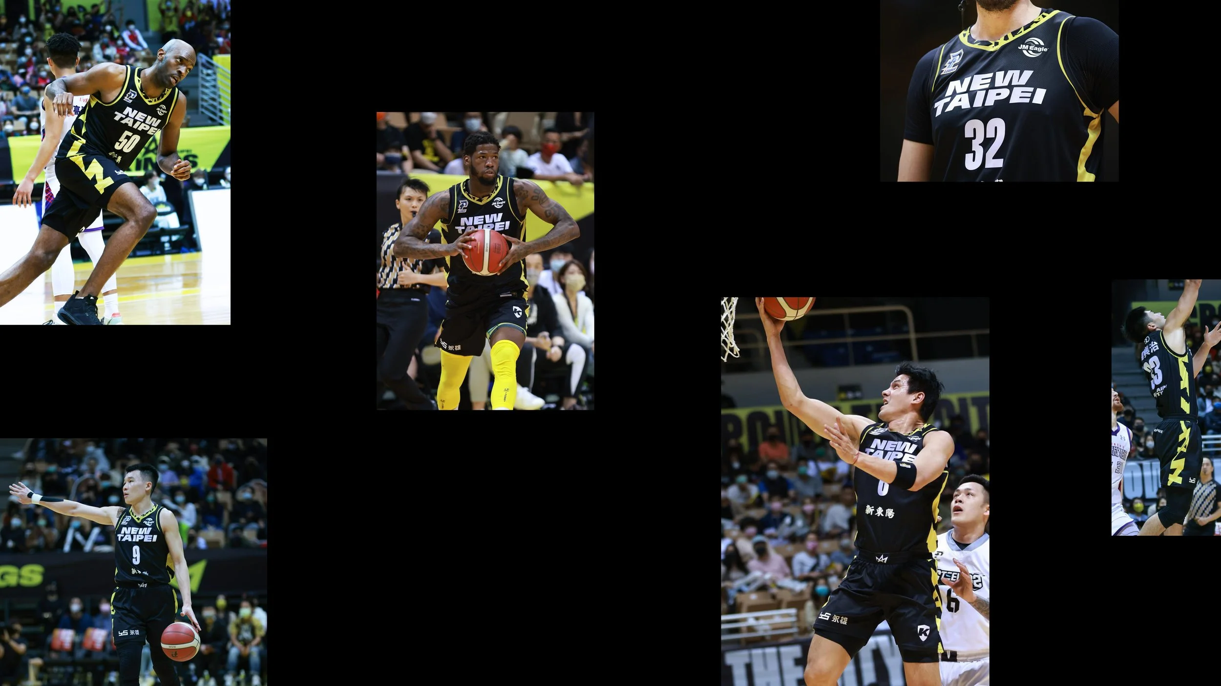
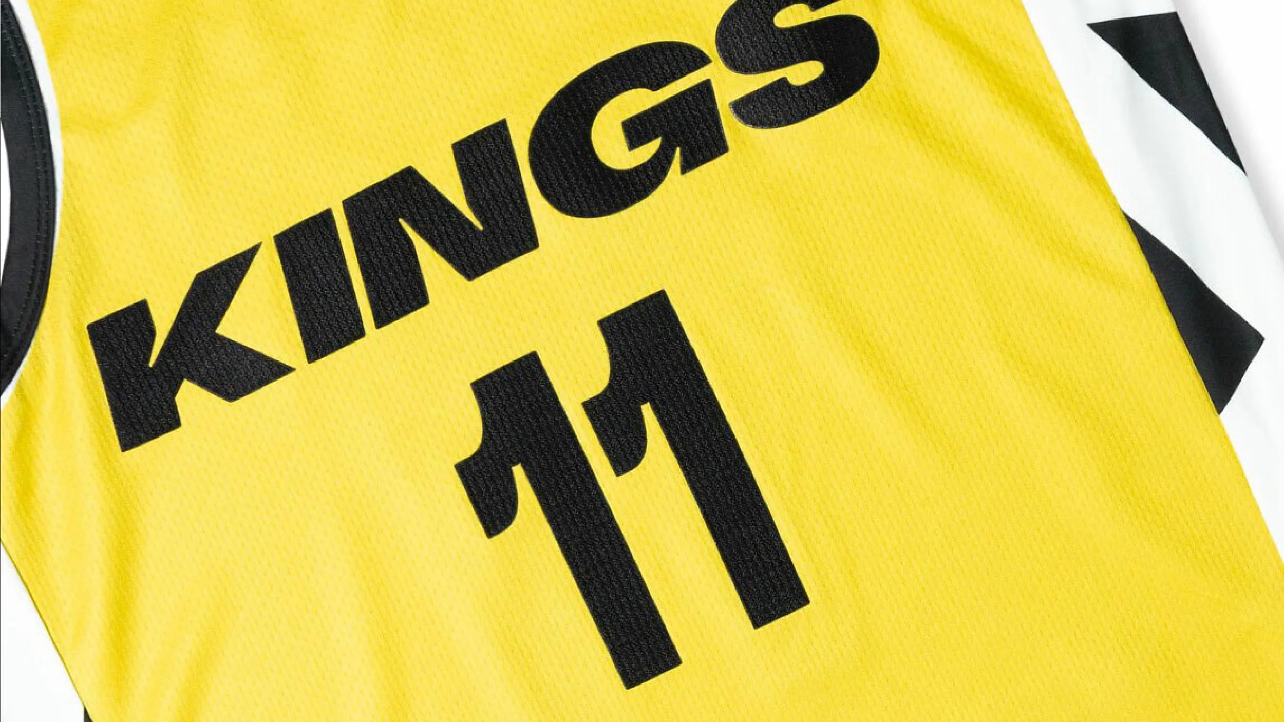
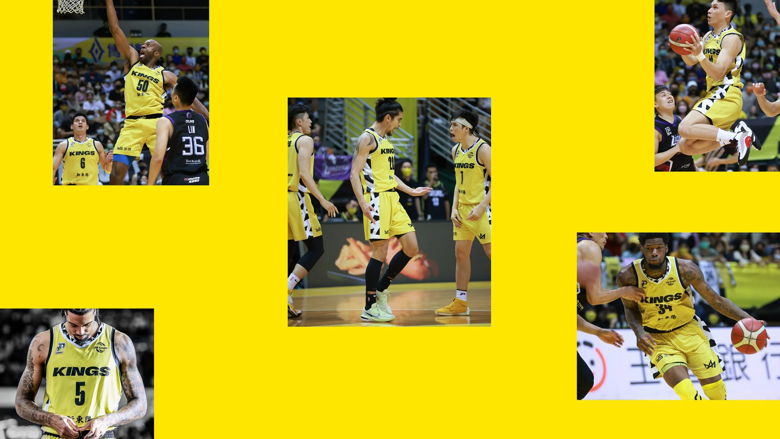
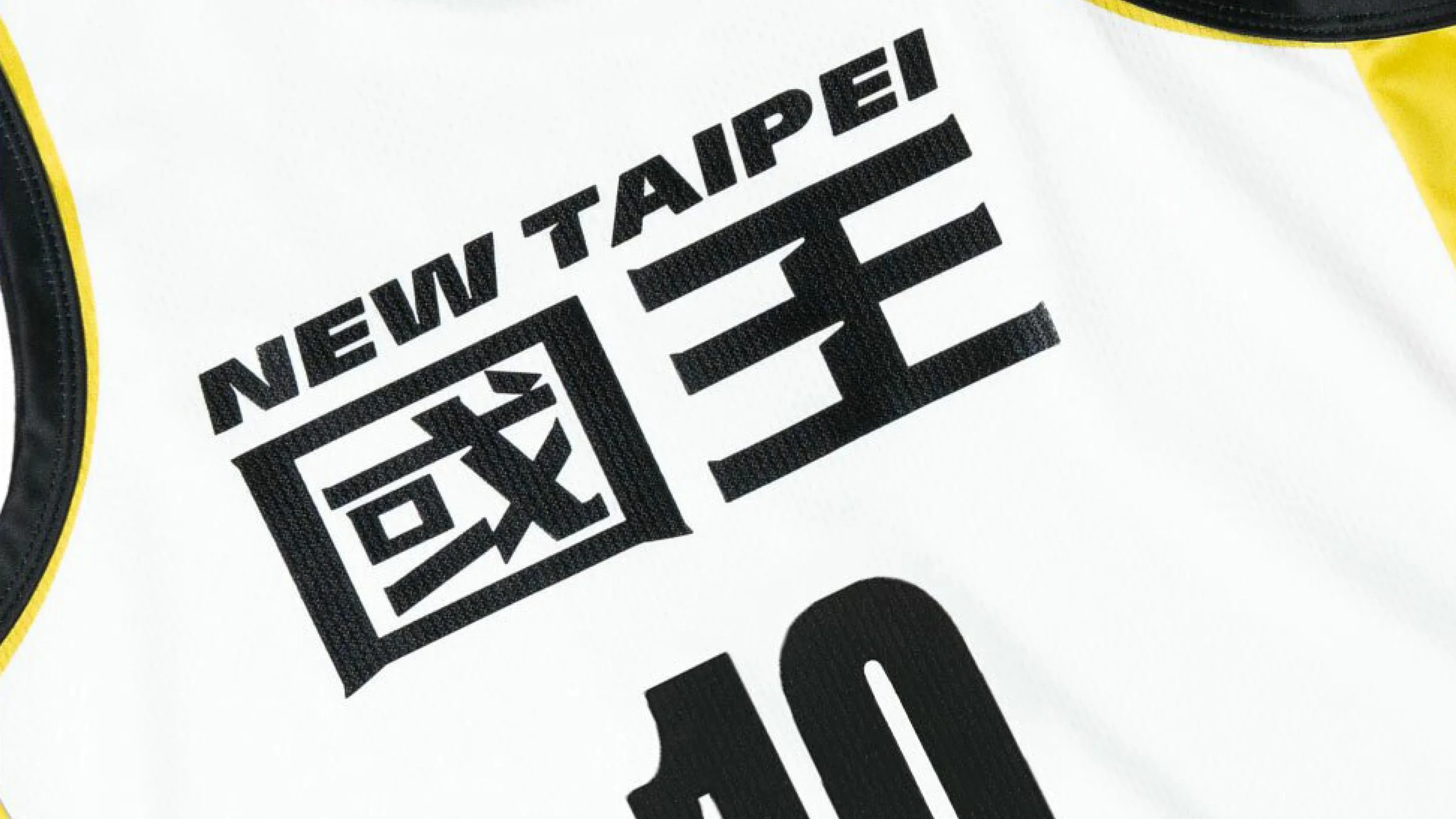
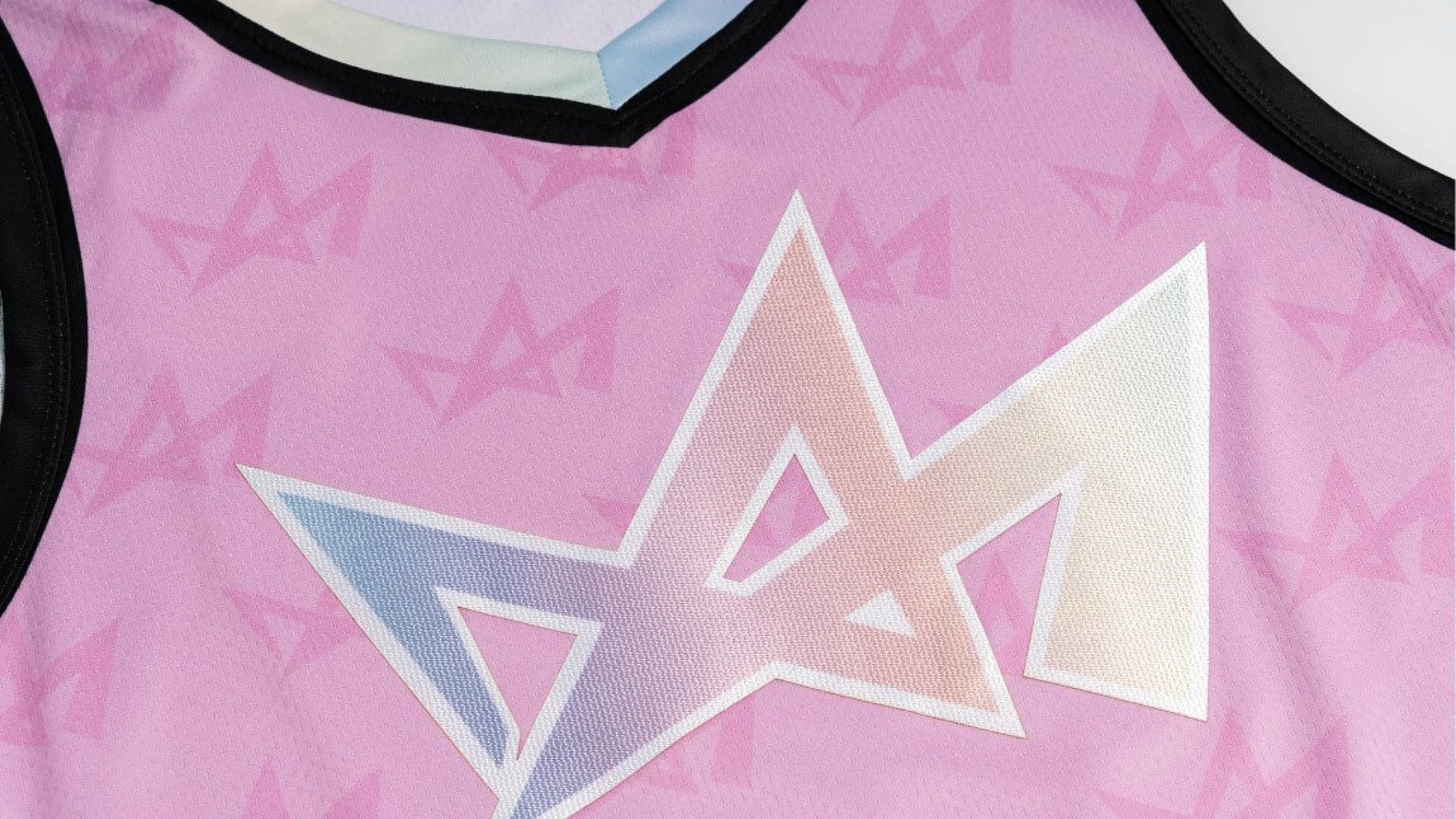
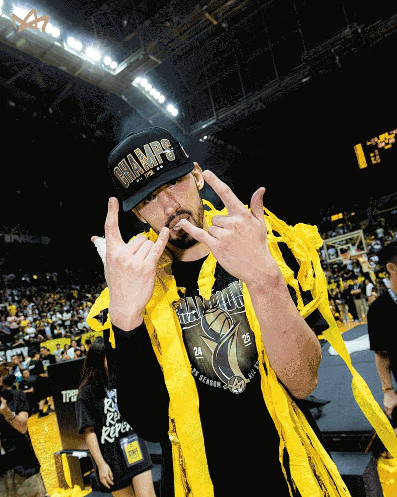
Around this passionate core we built an energetic brand system inspired by the pace of the game. Dynamic typography ensures this spirit is captured through every aspect of the brand, whilst the team's colours yellow, black and white reference the traditional colours of Chinese emperors, a subtle nod to the Kings' regality.
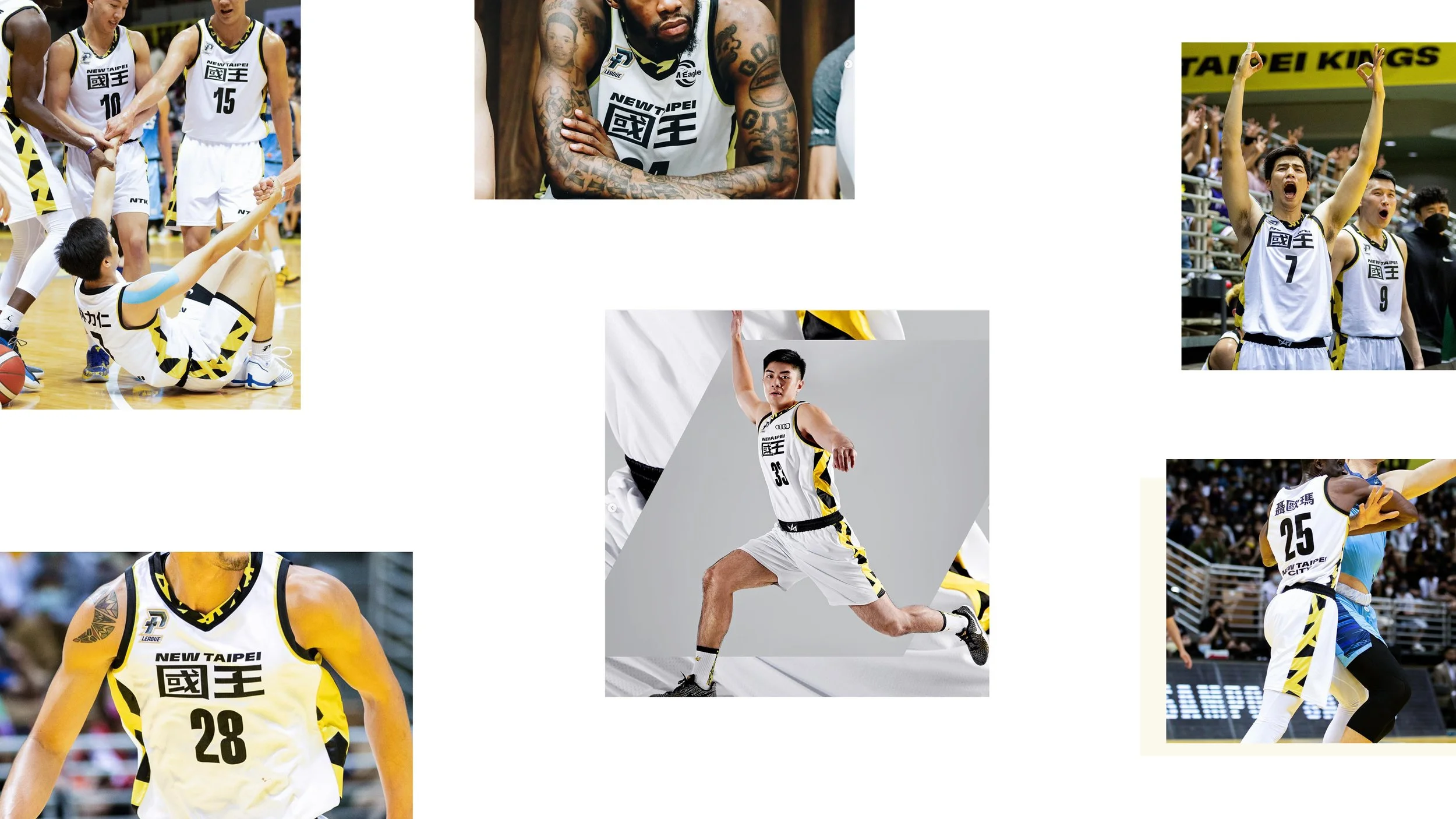
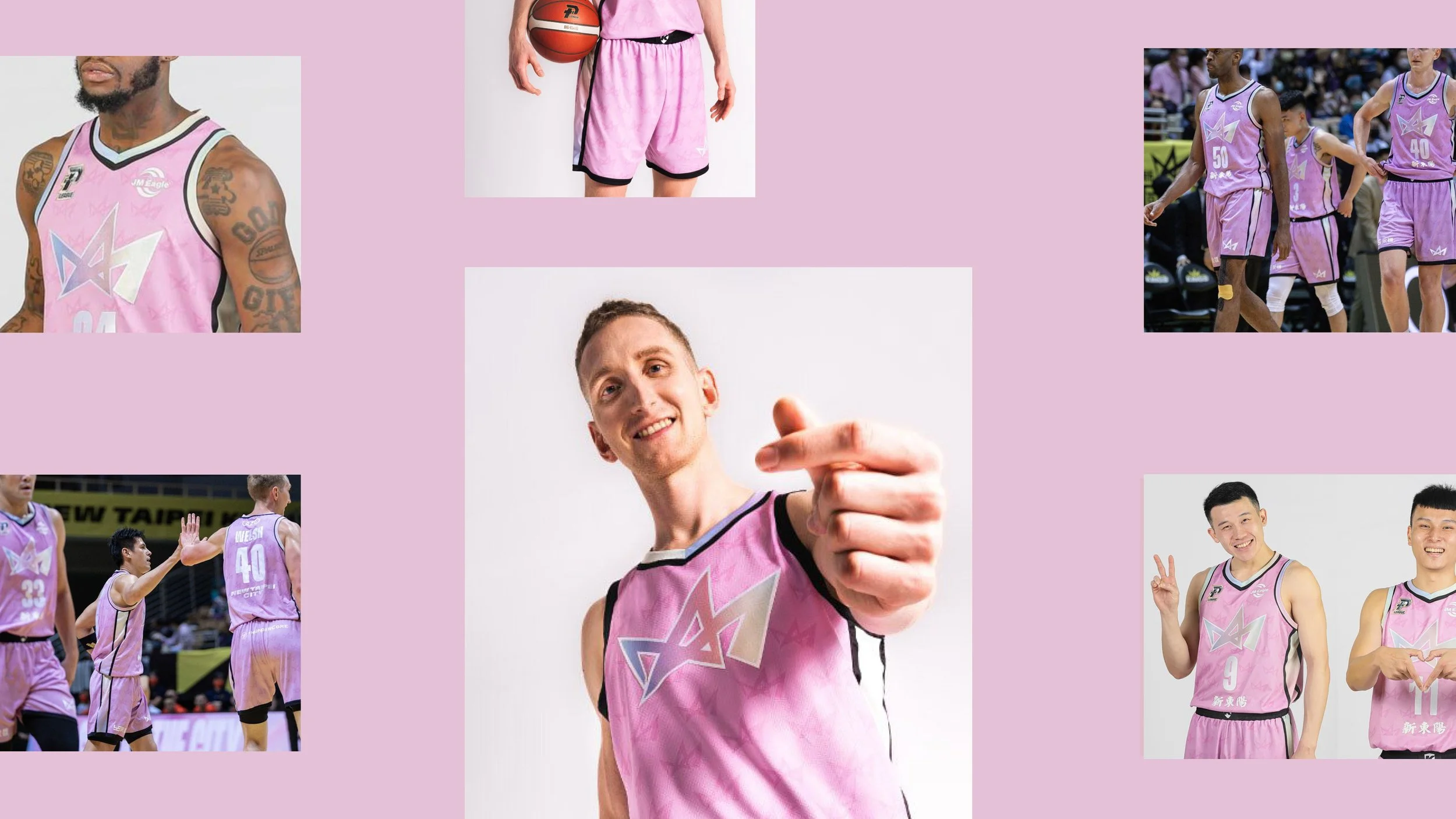
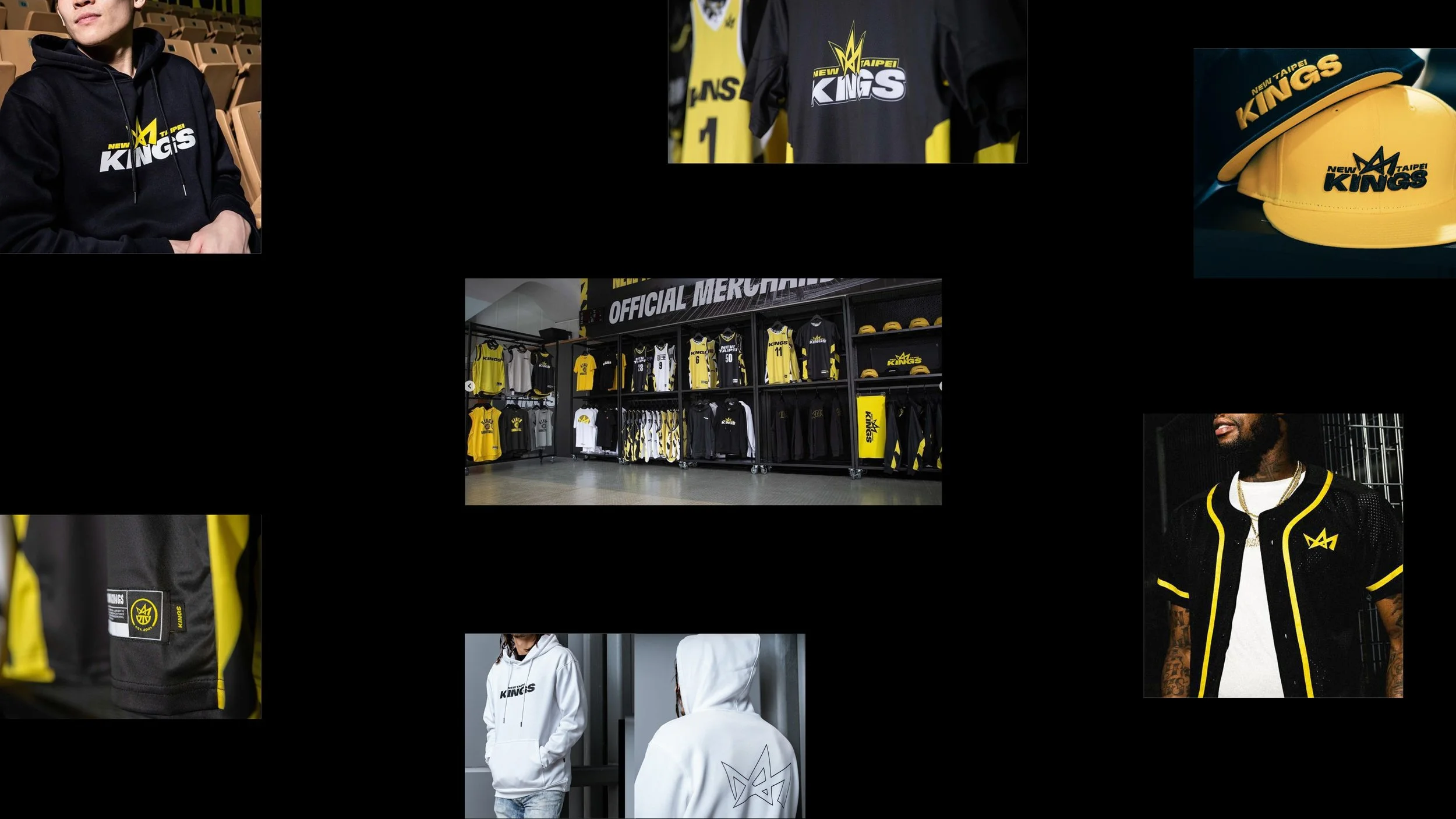
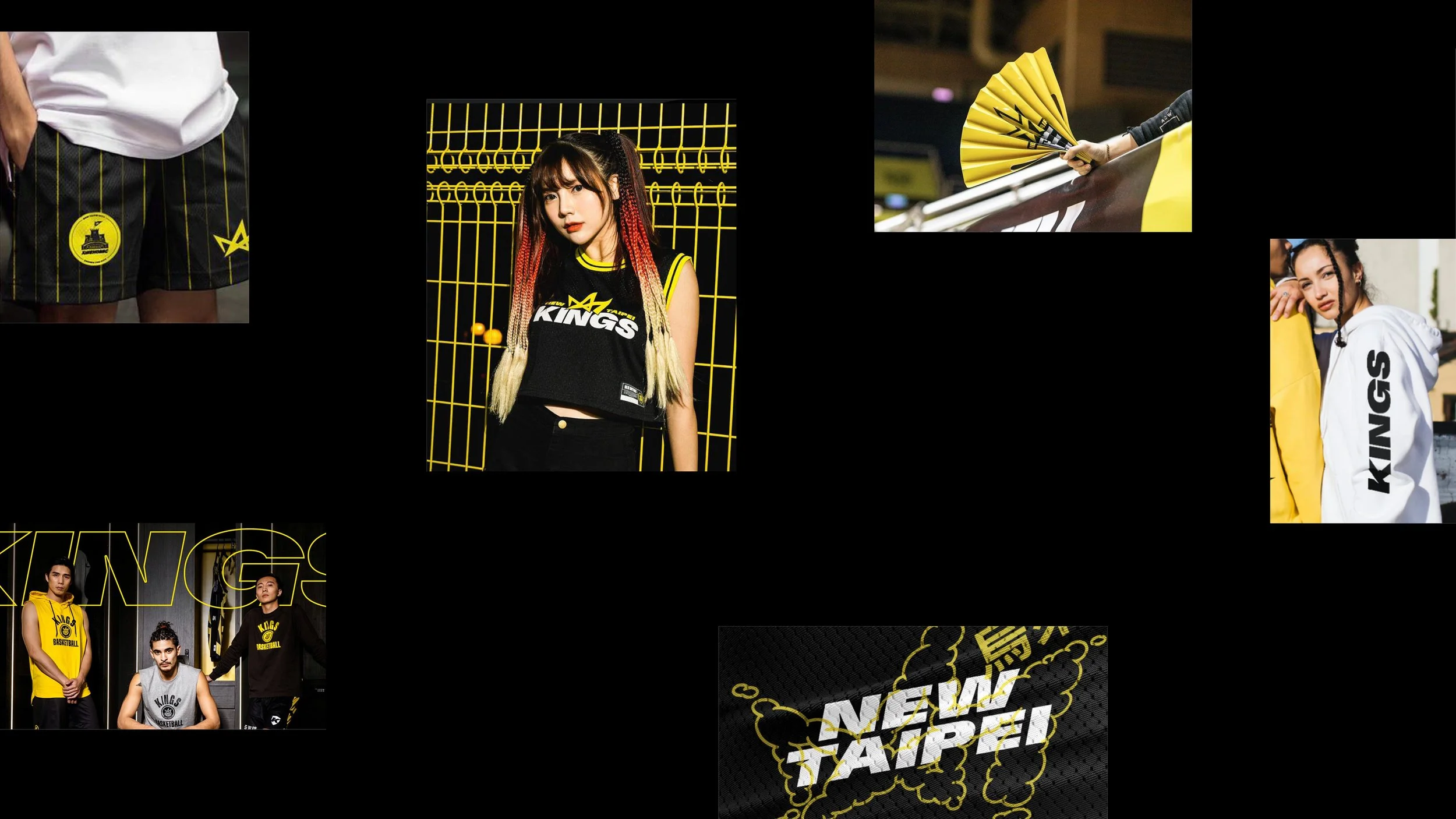
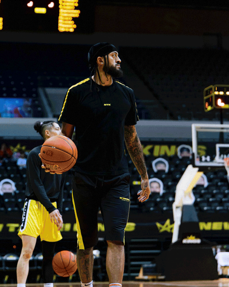
Like all sports brands, New Taipei Kings had to show up in a multitude of ways. We crafted each and every moment, from the chest of a jersey to court graphics, balls to branded merchandise. Everything connected back to the hero mark with the same dynamic energy to electrify the fans.
Comepleted at: Further
Role: Freelance Design Lead
Creative Director: James Duru
Lead Design Team: George Adams, Katie Cadwell & team
Strategy: Further Strategy team
Execution and Final Rollout: New Taipei Kings
Campaign Photography: Various c/o NTK instagram